Sapling
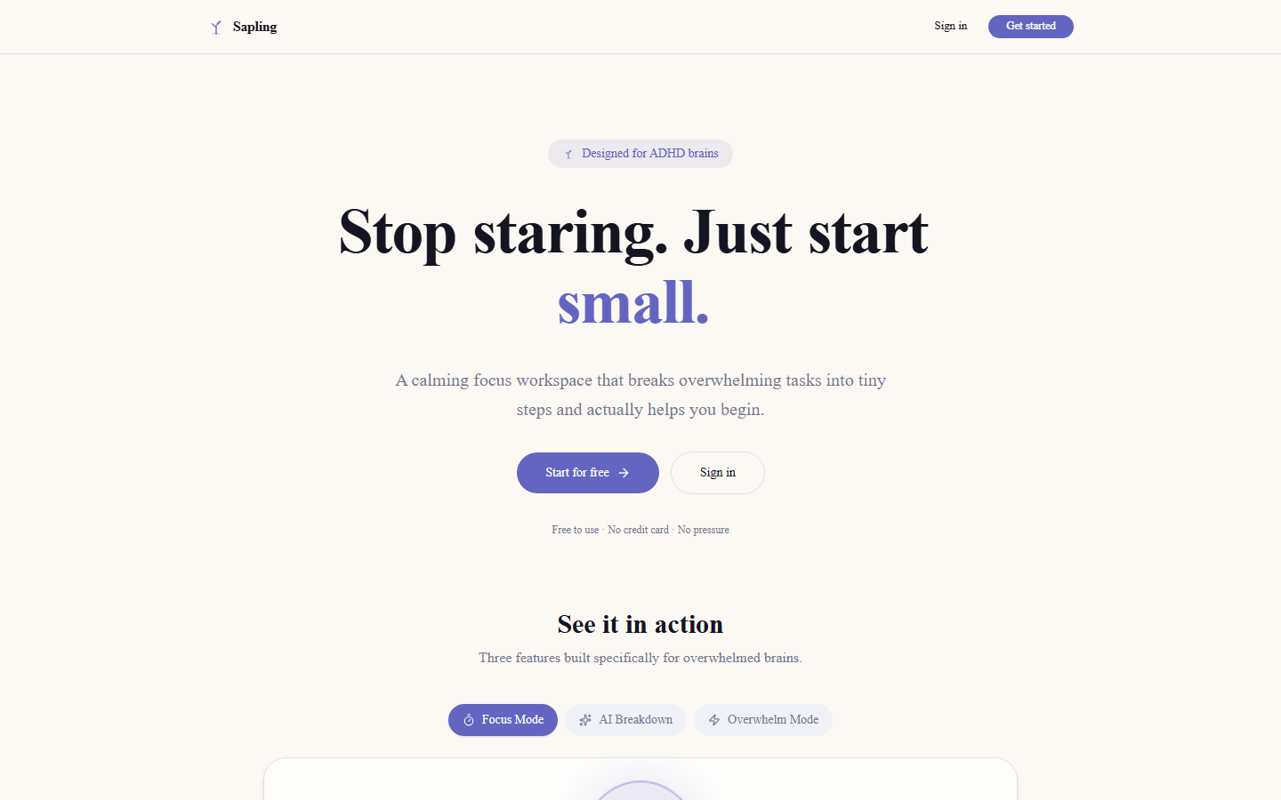
Most to-do apps hand me a wall of tasks, and that's exactly what makes me freeze. Sapling picks one and breaks it down before I can avoid it.
Task paralysis is real.
I have ADHD, and most productivity apps make things worse, not better. A long list of tasks is enough to trigger paralysis before I've done anything. The moment something feels overwhelming, I close the app and open a new tab instead.
I wanted something that would take one task, break it into steps that felt possible, and get me moving before the avoidance kicked in. Managing a list was never really the point. Starting was.
The design took longer than the code. Every colour, every animation speed, every piece of copy had to earn its place, and if something added visual noise, it got cut. The "overwhelm mode" feature, where colours desaturate and spacing widens once you mark a task as overwhelming, came out of pure frustration with apps that stay relentlessly cheerful while you're struggling. It's a small touch, but it's the one that feels most human.
The things that surprised me.
Calm and good-looking aren't the same goal
Making something look polished and making it easier to use under stress turned out to be two different design problems. A feature that makes the interface feel richer usually makes it harder to use for someone who's already overwhelmed. I cut a lot of things I'd already built once I noticed that pattern.
Groq made the wait disappear
Groq's inference is fast enough that the AI breakdown feels instant, with no loading spinner standing between you and the next step. That turned out to matter more than I expected for a focus app specifically. A few seconds of waiting is plenty of time to talk yourself out of starting.
Nobody notices optimistic UI when it's done right
Drag-and-drop reordering updates instantly on screen before Supabase has actually confirmed anything; if the write fails, it just quietly rolls back. Done well, this is invisible. You never feel the network lag at all, which is the whole point.
Using it myself caught what testing didn't
I use Sapling in the actual moments it's meant for, not just in a calm browser tab during a coding session. That changes what you notice. A bug that looks minor in a test pass becomes obviously wrong the first time you try to use the thing while genuinely overwhelmed.
What it's built on.
App router with server components. AI breakdown runs server-side so Groq API keys stay off the client. Server actions handle task mutations cleanly.
Task decomposition. Groq's speed is the reason the breakdown feels instant. There's no loading state, so there's no break in momentum, which matters a lot for a focus app.
Postgres for tasks and user data with row-level security. Realtime subscriptions keep the task list in sync across tabs without manual polling.
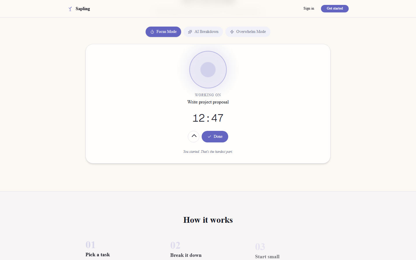
Handles all the transitions: the breathing ring animation, drag-and-drop reorder, overwhelm mode colour shifts. Every animation is tuned to feel calm, never energetic.
Lightweight global state for UI-only concerns like overwhelm mode and focus state. Kept the component tree clean without reaching for something heavier.
Utility classes throughout. The mood-adaptive design (desaturated colours once overwhelm mode kicks in) is just Tailwind variants toggled from Zustand state.